Wednesday, 25 February 2015
Analysing Billboard Magazine- contents page
At the top left of the page there is billboards logo, which is advertised throughout the magazine. The contents of this magazine has been split into four different sections. This will make it a lot easier for the reader and it suits billboards target audience. Each section on the page would have been created by using boxes for each piece of text. The artists on this page can been and are represented as confident and outgoing. The lady in the top right corner is looking and been represented as strong and independent . However some people may argue with that because of the way she is dressed.
The font that is used by the magazine at the bottom of the page is serif font or sans serif font. The layout of the information at the bottom is quite formal and very professional and upmarket because of its neat layout. This main image of this contents page uses a drop shadow which creates a 3D effect. The image is to the left of the page, drawing the audiences attention to the main story within the magazine.
Tuesday, 24 February 2015
Analysing The Courteeners- contents page
The page number and titles of this contents page are all down the left side of this page. Each of the titles have a brief description of what is on this certain page. Their is a smaller image on the bottom of the page in the middle. The picture is of Nick Cave who is a famous musician, author, songwriter, composer and sometimes a film actor. Nick Cave is from Australia. The audience of this magazine will find this artist very interesting. In the bottom left hand corner their is section called "Every Month". This section of the contents page shows what is normally featured in this particular magazine. This shows that their is a page about subscribing, this means that the reader/audience can subscribe to have each edition delivered to their doorstep each times that the magazine is released for a lower price.
The date and issue number is featured on the top right corner of this magazine. This shows the reader what month and week the magazine was made to be launched for. The title of this contents page is quite small and not as bold and eye catching as the other features of this contents page. The title is in capitals, bold and clear to the reader. Its at the top of the page to make it look more professional. The logo of "Q" is in the top left corner next to the title, it stands out with its bold and simple text. The main image dominates the contents page because of its size, this draws the reader to the picture. This magazine has done this because the want the image to be the first thing that the reader sees. It gives the reader an insight to what is going to be in this magazine. The picture has a pull quote, which gives a quick look into what the artical and story is going to be about.
Sunday, 22 February 2015
Analysing Kayne West Magazine- contents page
In the background of this contents page there is a grey V which stands out for the from cover title which is VIBE. The small writing to the left of this page says who designed the front cover and who designed this contents page too.The colour scheme of this contents page is grey,black and white apart from the bright red heart with contrasts with the other colours. The darker colours give this page a masculine feel to the magazine. The same artist (Kayne) is the only person on the contents page and the front cover, so the artist is the attracting point to this particular magazine. The artist is Kanye West who is a famous rapper.
The words contents is the biggest lettering and most bold lettering on the whole of the contents page, this is so the reader knows its the contents page. The letters in this title are not all in the same line making this page look quite different and unique compared to other magazines. Their is a little 1/3 to the left which shows the reader how long the contents page is. The colums is in the bottom right of the page and its divided into sub headings. In the right corner their is some writing that says who has done this particular piece of photography and says when are where these photo were taken.
Friday, 20 February 2015
Analysis Muse Magazine- front cover
The genre of Kerrang is rock and the target audience is more male based but also for women aged from around 17-30. The mast head is bright and bold at the top of the page. This is important because it will help draw the audience in and they will know what magazine it is. They are more likely to buy it if it has big fonts to draw the reader in. The mast head is the same type of style and font in all their magazines but can sometimes be different colours, depending on the magazine. The magazine uses "puff" words in capital letters which suggests to the reader that the magazine is worth while buying because you get 5 free gifted posters.
The magazine uses the word "teaser" to make the reader want to buy the magazine. This will make the reader/audience interested to what this teaser is so they will be more willing to buy it because that word will interest them into the magazine. The graphic features are very effective as there is 10 all on the front cover,they are all rock bands and the magazines target audience will know all the bands. Many of the artists and bands is posing in their signature move and looking at the camera to draw the reader in.
The yellow circle is advertising a big festival that many fans of rock music will be going to attend. The harsh yellow circle will catch the readers eye and attention. The audience of this magazine may want to read about festivals so therefore may buy the magazine.The colours are also used to tie in with the house style.
Tuesday, 17 February 2015
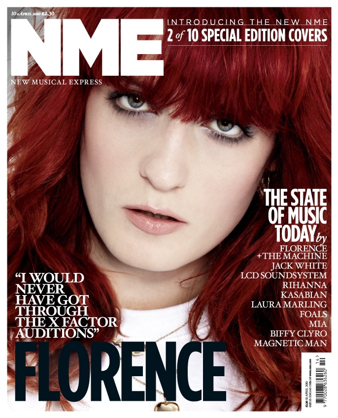
Analysing Florence Magazine- front cover
The new NME logo has stuck to the original front however the colours of the logo vary and white outline has been removed.The slogan has been placed under the NME logo. The slogan is telling the audience of the magazine what the initials NME stand for. On the cover image NME have used a close up shot for this issue of Florence. This close up shot of her will draw the reader in because it will draw in the reader and it will feel more personal. This image of Florence fits in nicely with the colour schemes. Her big red locks contrasts with the bold white writing and it helps it stand out. In the main cover line NME shows the reader the main story in line the magazine and often relates to the cover star. This is a feature that NME used in my first cover analysis.The black font is the only black text that is used therefore it stands out the most.
The barcode is to the right side of the magazine in the bottom corner. Its their so its squeezed into the corner and out of the way of the more important information. Small and barley noticeable so the reader/buyer of magazine wont be focused on the price they will be focused on the main artist and cover stories. The cover line acts as an advertisement to the reader bu telling them about the many other good features that are inside the magazine, this will help encourage the reader to buy the magazine. The bold white text contrasts with Florence's bright red hair so it can be read clearly by the audiences of the magazine. The other cover line in the top right tells the reader that they are looking at a special and limited edition of NME. It also tells the reader that the magazine has changed which will help make the reader want to buy it because they will want to see what has changed about this magazine.
NME informs the reader of how much the magazine will cost to buy and the magazine tells the audience the exact issue number. The issue number on the mag will end up been more helpful for the regular readers of NME and the price will be more helpful and relevant to new readers of NME or those how don't or haven't read it.
Analyzing Eminem Magazine- front cover
The image that Vibe has used is a famous artist (Eminem), this immediately attracts the attention of the readers that are interested in this particular genre of music or fans of Eminem.The image of Eminem is forward in the foreground, looking in the readers eyes bringing his stance to attention of the fans/readers. His head is over the title with makes him stand out more and it shows he has a story he wants to tell. The title and the picture link together and includes a big quote that will draw the reader in and grab their attention,"I literally almost died".The name of the rapper (Eminem) is also is big and bold red writing with will help draw the reader in because he is a famous rapper with a story to tell.
The mast-head of the magazine is in bold writing and then continues the colour scheme of the magazine, which is red and black. These two colour schemes (red and black) are linked with danger and strength and often shows both of them things. That links in with the main artical because of Eminem's dangerous and near miss "street" lifestyle.
Their is a couple of articles spread around the cover, which will help draw the main attention of Eminem and his dangerous lifestyle but also says that their is a lot more included in this artical and it also suggests this.
For this particular music magazine Vibe are going for a tough and hardcore look for this front cover, showing that Eminem is strong and powerful this is shown through the artists stance and body language(standing strong with his arms crossed looking in the audiences eyes with a tough and hardcore look. The fonts and colours used also show the powerful and tough look they were aiming for because red and black and linked with danger.
Monday, 16 February 2015
Analysing Beyonce Magazine- front cover
- close up of the artists face
- very natural colours and natural light
- the artists head fills the majority of the photo- which makes her the only focus
- there is no other images on the front cover- so the reader is not distracted from the artist
- makeup- natural colours, flawless skin, very natural copper/brown eye shadow
- Beyonce's name is in a bold and white font that contrasts with her golden hair
- the artist has shiny red nails that stand out and that also makes what shes doing stand out
- her red nails and the artist biting the wood brings the attention to her mouth
- the title of the magazine "billboard" which is in big bold writing- it also has three colours in the circles that stand out and that appeal to different people- the colours are red, yellow, blue and green
- the title of the magazine is effective because its a hit pop/modern music magazine
- has information about whats in the magazine and the artist down the side in white bold and contrasting writing
For this magazine billboard was has done it really well because they are a hit pop/modern charts music magazine so they have picked the perfect person for there magazine, the queen of pop Beyonce. Who is loved and adored by millions from all different genders and ages. This helps make this particular magazine really special because Beyonce is such a hit artist and she + the magazine (billboard) will make this issue such a hit. The main photo is of Beyonce and its a close up of her. This picture works really good for the magazine because this makes her the focus of this issue with her big sun-kissed lions mane covering the majority of the photo. The artists makeup is fairly natural with a copper/brown eye shadow which will read the reader into her eyes. Because she is looking at the reader it make it a lot more personal and it will draw the reader in. The title of the magazine is very effective (billboard) its big, bold and draws the reader in because of the four different colours in the name. The name "billboard" stands out and is very effective because a billboard is somewhere that you would get information from and this magazine is just like a billboard because its giving information and stuff that's going on with the artist, in this case Beyonce.
Saturday, 14 February 2015
Analyzing Adele magazine- front cover
- close up of Adele's face
- she is looking into the audiences eyes
- wind swept hair
- clear white skin with a copper/brown eye shadow,black eyeliner and light pink lipstick
- matte purple nails
- white background
- colour of her clothing- rich purple
- Adele's name it big and bold writing which contrast with her purple clothing
- no smaller images on the front cover which makes her the main focus
- writing down the left side
- quote from Adele above her name
- writing in red and white
- Adele's head/hair going slightly over the title
- name of magazine "Q" bold in the top left corner
- colour themes of magazine cover- red and white
For this magazine Q stuck with there two well known house colours of red and white throughout the front cover even though Adele was a big deal to have on there front cover and to write a double page spread about . The photo is a close up of Adele's face with her perfect highlighted skin and light makeup on. The magazine has done this to show her flawless skin but also to show her innocents. The close up helps draw the reader in and Adele is looking at her audience which will also help to draw the reader in because it makes the magazine look more inviting. This is were the rich purple comes in as a contrast to show the more wild side of Adele. The white background helps to keep the readers focus on Adele and makes her stand out and be more bold. The magazine have made sure that Adele's name is in big and bold writing so the reader knows who the artical is going to be about and the magazine has put it into bold white writing to contrast with Adele's rich purple clothing. The front cover has no smaller images on it to keep the focus on the artist.
For my project i will be linking a lot of these bullet points when doing my front cover for my magazine. I'm going to use the natural wind swept look to show the natural side of my artist but will also try and use a contrast to make my artist stand out from the background. I'm going to have my artists name in bold writing to make it stand out to the reader which will draw my target audience in and make them more interested. For the photo my artist will be looking into the readers eye to draw them in and to also make it more personal because each of the reader will get something different from the photo. I will also stick with only a couple of colours.
Wednesday, 11 February 2015
Practice school magazine
Before starting my official magazine on music I had to do a preliminary task where I had to do a mock of our magazines. For this we did a school magazine front cover and context page. Firstly I had to consider the codes and conventions of a school magazine.
Codes = are systems of signs,which create meaning.
Conventions = are the generally accepted ways of doing something.
After considering all that i drew up a plan for my magazine which included- what kind of images would be on the front cover and contents page, the language that i was going to use and it contained two sketches one of the front cover and one of the contents page. The sketches roughly showed what i was planning for my magazine to look like.
The final stage was taking loads of photos and moderating them until i found the perfect picture for my front cover and the pictures for my contents page.
Final product of school magazine-
Subscribe to:
Posts (Atom)